Flippin’ Moodys
PROJECT SUMMARY
Flippin' Moodys is a mother and daughter trio of house flippers operating in the Metro Detroit area. A younger, modern spin on flipping houses, they do it all--- from buying homes to tearing them down and building them back up. All with the mission to bring young adults a flipping' amazing place to call their own.
BRAND STRATEGY
STYLESCAPES - VISUAL BLUEPRINTS FOR CREATIVE DIRECTION
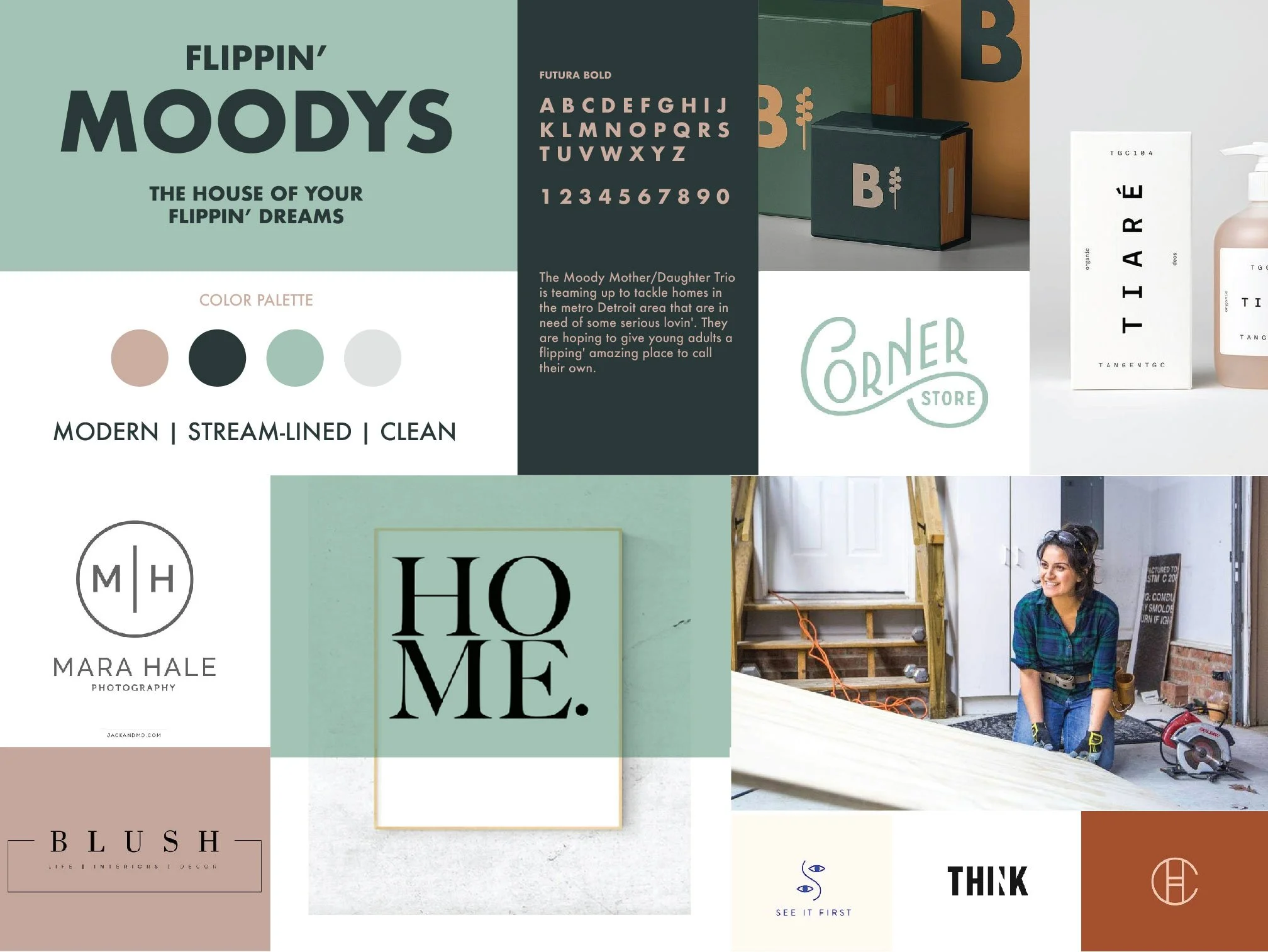
Before any design work began, I built three visual directions that served as Stylescapes. These are highly curated moodboards that showcase potential design themes, fonts, color pallettes that help give a greater sense to what the branding will feel like.
They also serve as a reference point throughout the design process and serve as visual roadmap for the design decisions to follow.
VISUAL IDENTITY
FORMING A SOLID FOUNDATION
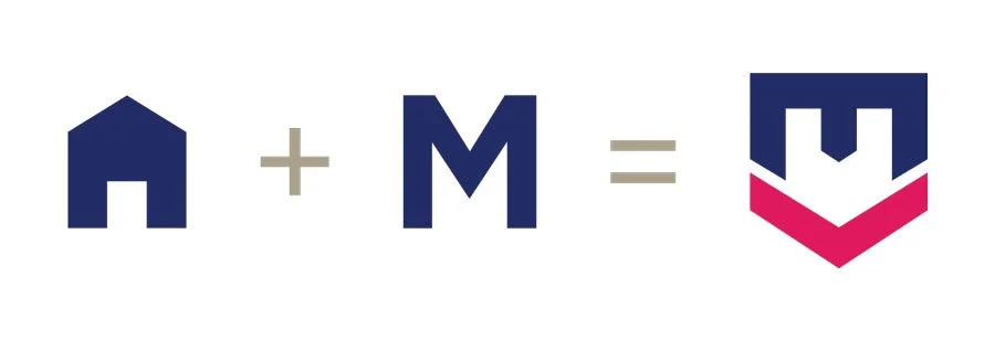
The logo icon was devised from the letter M in their name, with the symbol combining an M lettermark with a upside down house. Care was taken to ensure readability and boldness to help the mark stand out from distance.
CLIENT TESTIMONIAL
“Tim helped my wife bring her flipping business to life with a logo that perfectly captured what she was building. Tim took the time to understand her vision, the feel, and how the brand needed to come across. He was patient, creative, and is extremely talented. On top of the creative process, Tim is just a good person to work with. He's communicative, thoughtful, and invested in doing it right. We couldn’t be happier with how it turned out and would absolutely recommend him to anyone looking for branding or design work.”
Anthony Shaheen - Flippin’ Moodys


