FLIPPIN’ MOODYS
SERVICES
STRATEGY
LOGO DESIGN
BRAND ACTIVATION
YEAR
2019
SUMMARY
Flippin' Moodys is a mother and daughter trio of house flippers operating in the Metro Detroit area. A younger, modern spin on flipping houses, they do it all--- from buying homes to tearing them down and building them back up. All with the mission to bring young adults a flipping' amazing place to call their own.

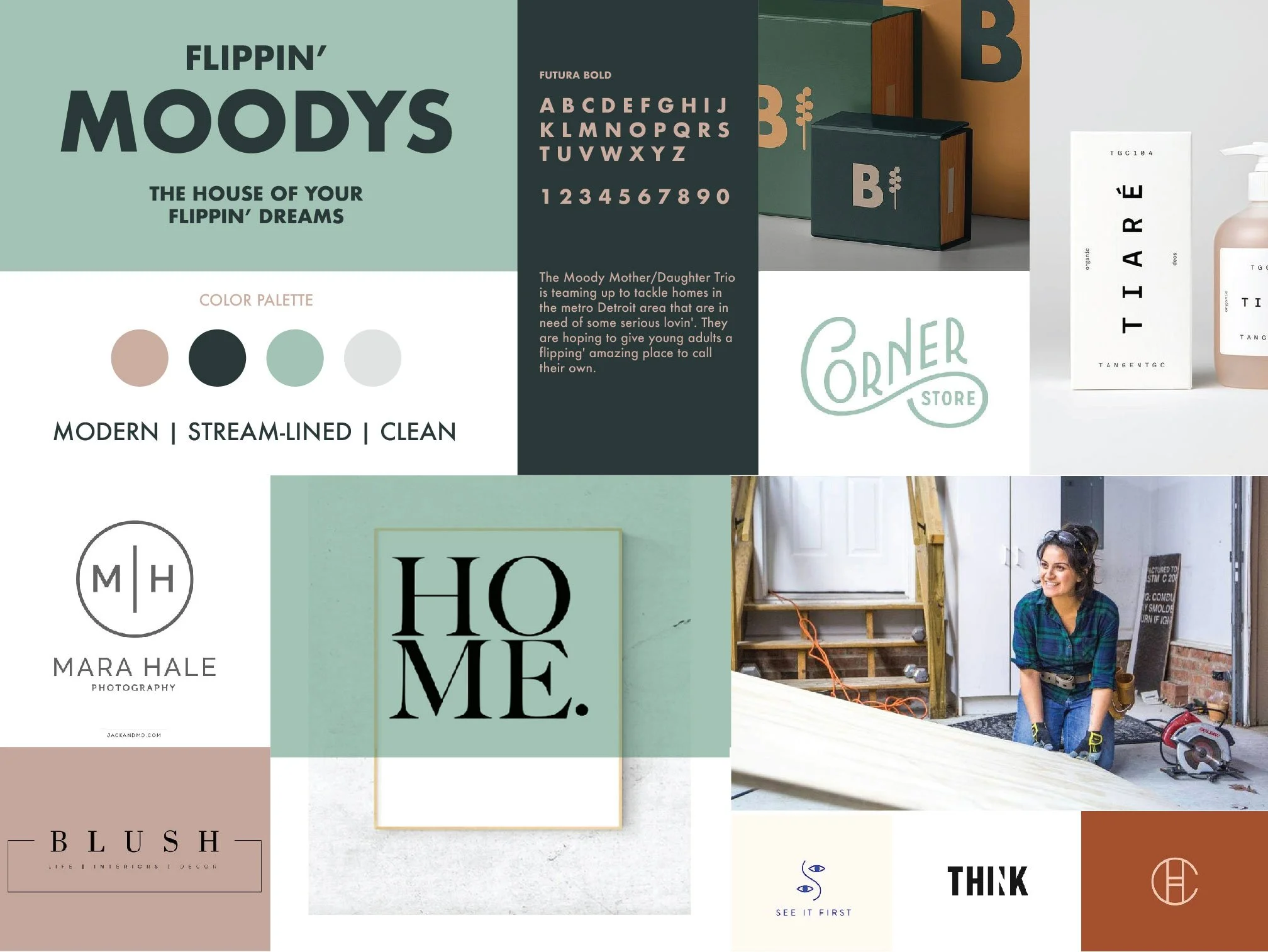
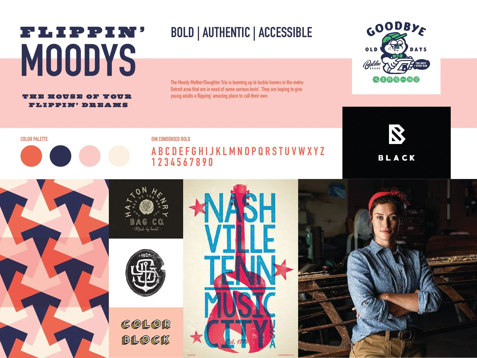
STYLESCAPES - VISUAL BLUEPRINTS FOR CREATIVE DIRECTION
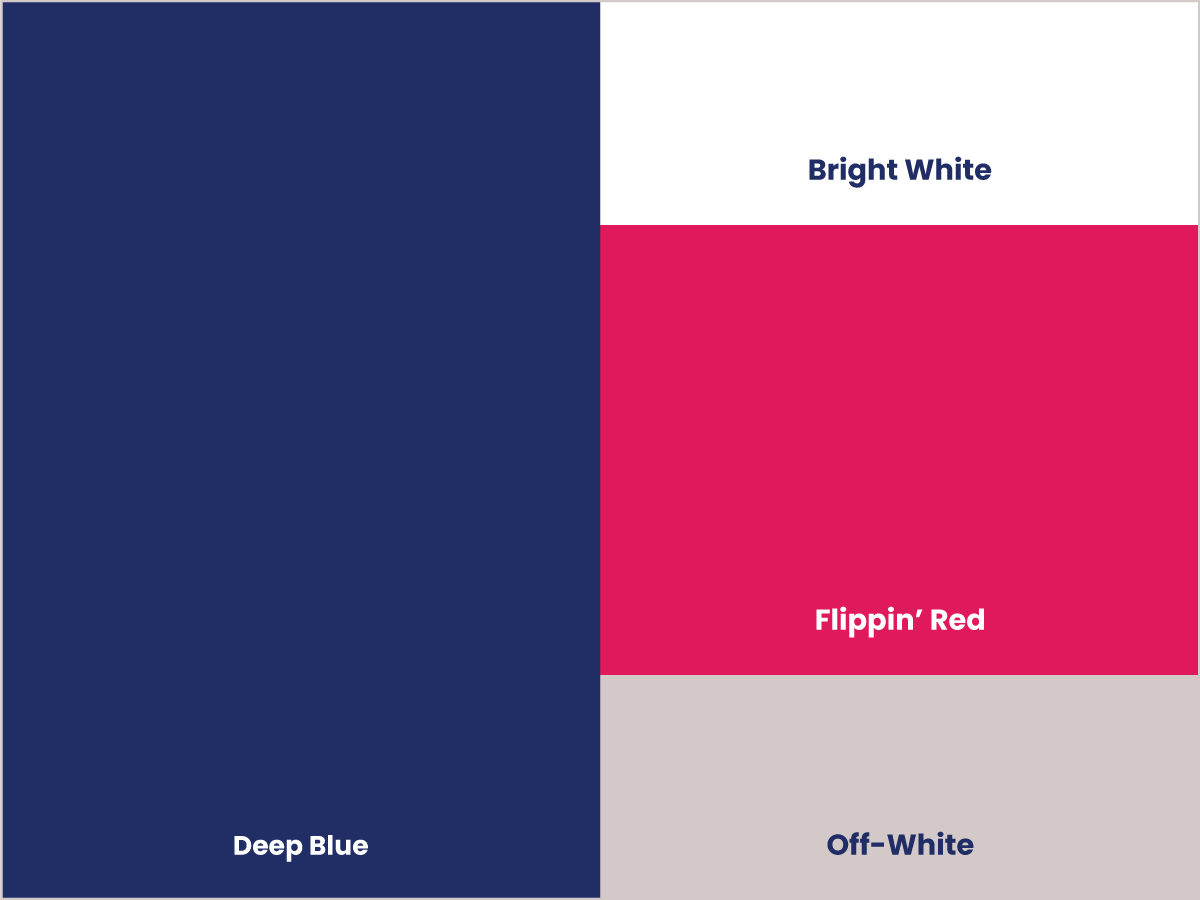
Before any design work began, I built three visual directions that served as Stylescapes. These are highly curated moodboards that showcase potential design themes, fonts, color pallettes that help give a greater sense to what the branding will feel like.
They also serve as a reference point throughout the design process and serve as visual roadmap for the design decisions to follow.

FORMING A SOLID FOUNDATION
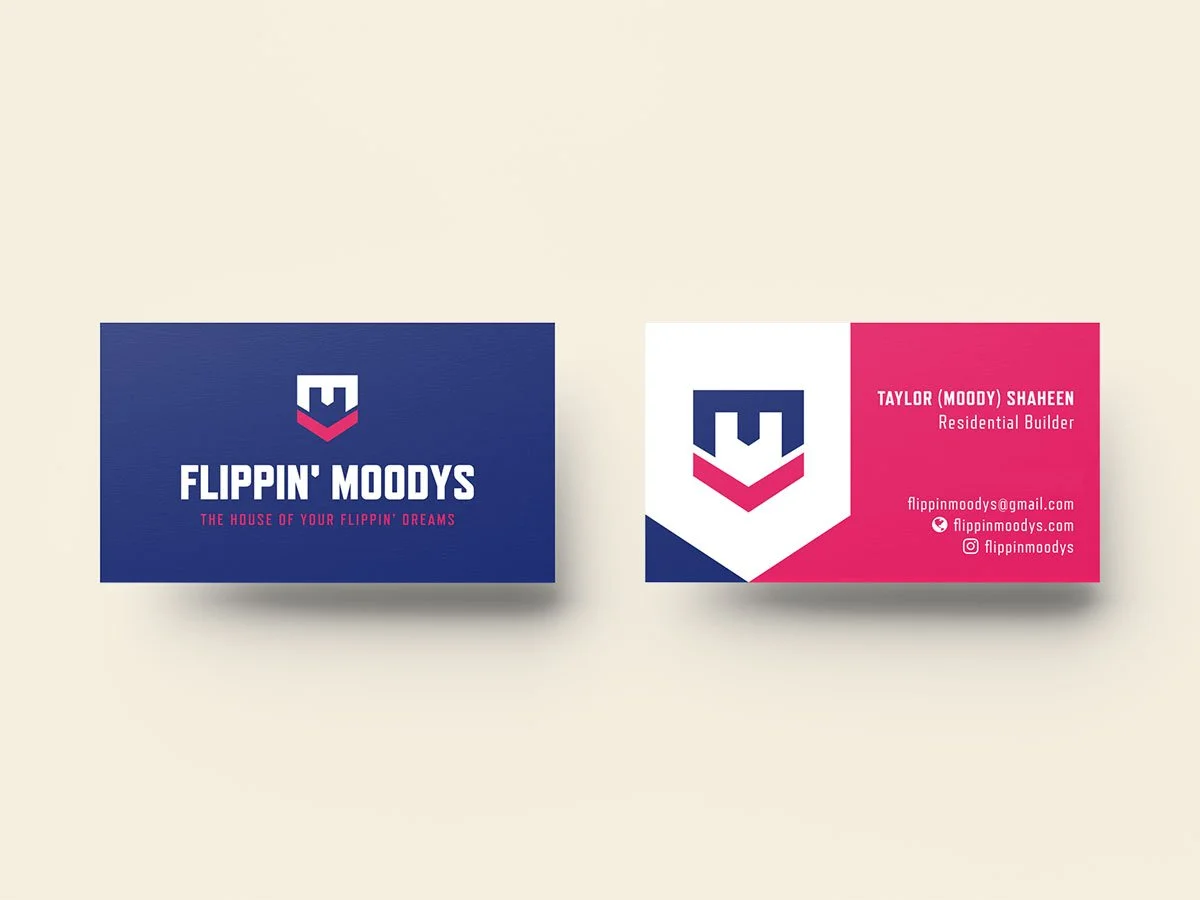
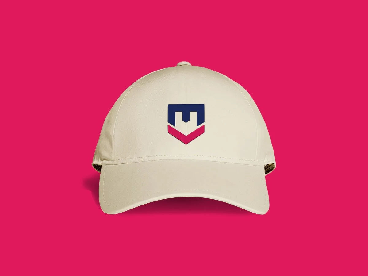
The logo icon was devised from the letter M in their name, with the symbol combining an M lettermark with a upside down house. Care was taken to ensure readability and boldness to help the mark stand out from distance.